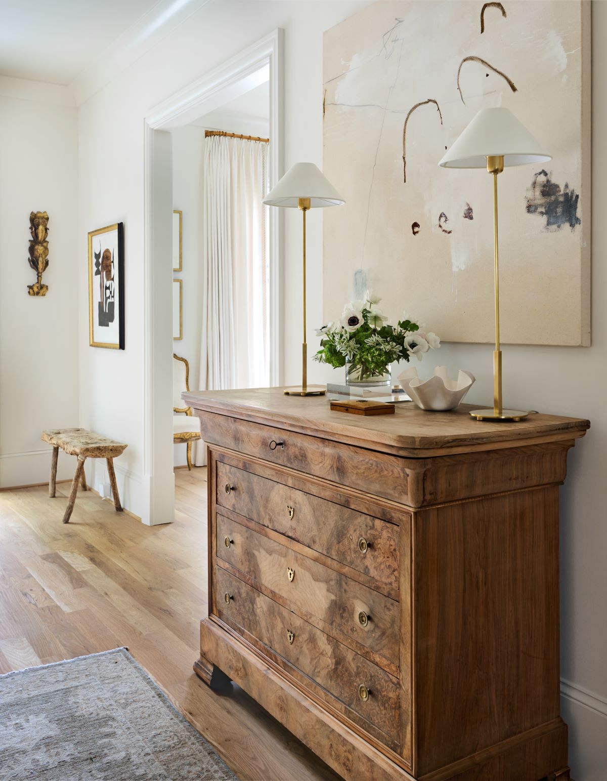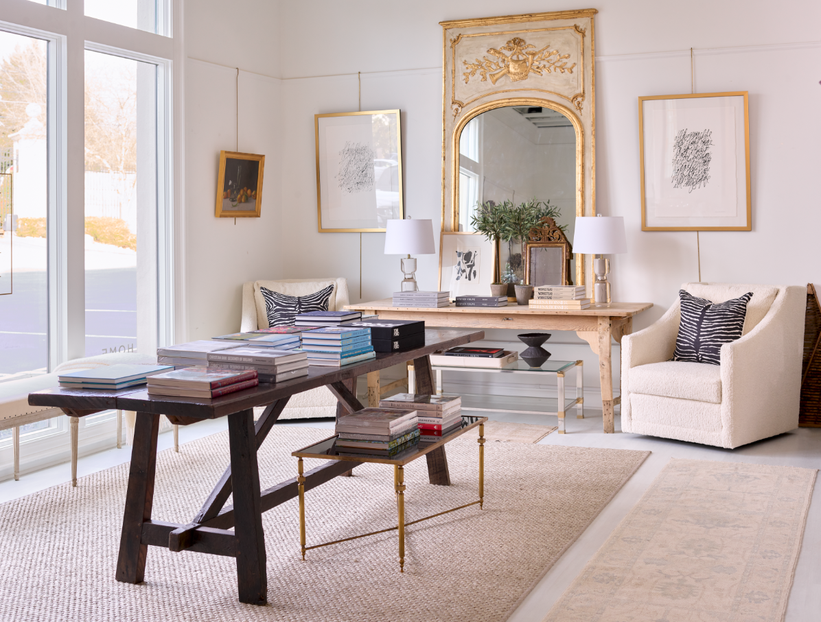
Welcome to my home office, where up until this week, I’ve spent just about every waking (and sleeping) hour! Despite all the uncertainties and the pain that we’re faced with during this time, I have loved my time at this little desk, facing a favorite painting in a cozy and soothing bedroom. It’s been a great refuge where I can be happily productive. But it wasn't always so!
This is a tale of mistakes in decorating, and the lessons I learned along the way.

Flashback to our purchasing this condo in the sky. The master bedroom was a decent size, had a great view and a closet that was OK for one but absolutely not an option for two!

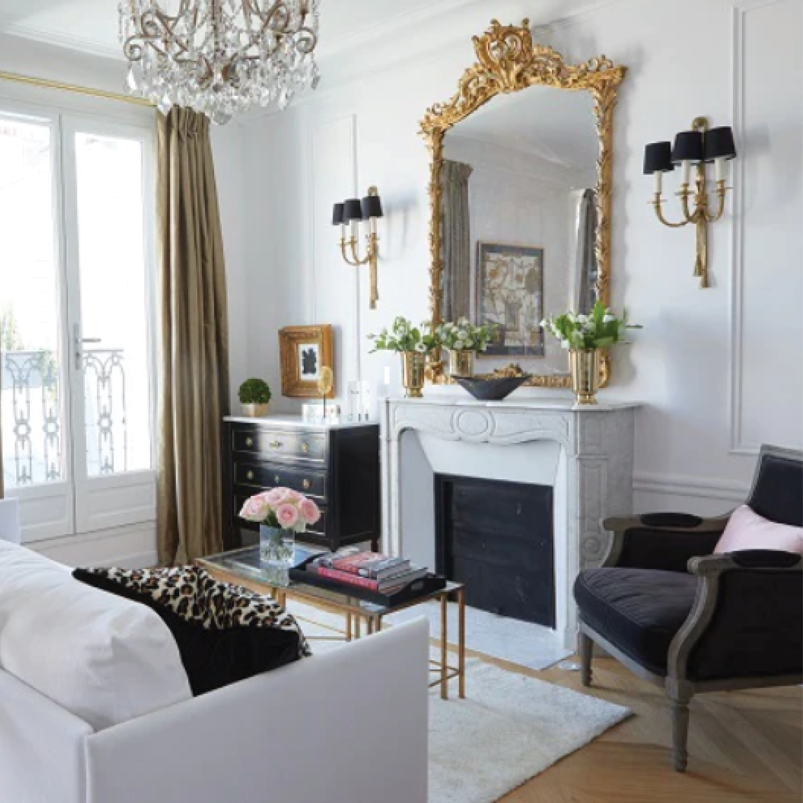
So, picking up on some redo’s we’ve done in Paris (like the one above), where bedroom space is always at a premium, I designed two closets on either side of the room and wedged the bed in between. That was NOT the mistake, as this is a great space saver solution if your room is wide enough.
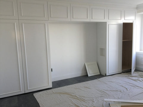
The mistake came with paint color. The floors are a dark cappuccino color, the walls in the rest of the apartment are a cool white and the room faces East, so it gets morning sun but goes cool for the rest of the day. I had the closet doors painted in the same Wevet color as the rest of the apartment, but before the renovation was completed, I saw it, panicked and hated it. It looked cold and unwelcoming and I couldn’t imagine how to warm it up.
Instead of waiting it out, furnishing the room and living with the color, I immediately had my contractors repaint it. THAT was the mistake.
Easy fix? (I know, we always say that paint is the easiest fix!) Not quite, when the painting involves taking the doors off the wall to an offsite cabinet maker who uses a specialized spray paint to the tune of ka-ching ka-ching ka-ching. That’s not all. I repeated the mistake and picked the wrong paint color again, opting for the warmest grey I could find (Dorian Grey by Sherwin Williams). It was so terrible that without even testing swatches, I quickly changed once again, opting for a safe choice with our very familiar Worldly Gray, a color we’ve used over and over and never had a problem with … until now. In this room, this otherwise lovely warm grey turned into a muddy beige, the color that we all happily left behind in the 1990’s. Ugh!
At this point, there was no turning back so I pouted quietly for several months and tried to ignore the fact that my bedroom was cold, drab and unwelcoming.
And then Trudy and the designers started bringing in all these pretty, fresh wallpaper and carpet samples to our design center at Huff Harrington Home and all of a sudden my interest in the bedroom perked up again. I fell in love with some of the patterns and texture of the glamorous Schumacher wallpapers, married with a few other Schumacher fabrics and trim.

What if instead of hating the color of the walls, I embraced it? What if I used it as a backdrop to some gorgeous wallpaper? What if I focused on pattern and texture instead of paint color? What if, with just the help of a few key pieces and without breaking the bank, I could turn drab into glam, and cold into cozy? What if, said the designers, and all of a sudden it started to click!

What if I put some sexy wallpaper behind the bed and added a rug to soften the floor?

What if I embraced the neutral and used pattern and texture to give the room interest?

What if I let the walls be a backdrop to my favorite mix of paintings?

What if I let the view be the star and the soft palette be the refuge?

What if I found some sexy fabric for the bench and the chair to jazz it up?

Basically, what if I swallowed my mistake, didn't repaint and never looked back?
I will admit that there was a little crush on Schumacher fabrics and wallcovering that smoothed the way (and no they are not sponsoring this post!). But it was a good lesson in how to turn a problem into a solution ... and get a better night's sleep!
So here are the lessons:
- Before you pick a paint color, know your compass and the rules of cool and warm (our designers are experts at this and love to provide you some direction)
- Always test a color on several walls, especially if the paint involves expensive cabinetry
- Don’t panic if you’ve picked the wrong paint color. It can (usually) be an easy fix
- Use texture, pattern, wallpaper and fabrics to create depth and interest
- If you’re “stuck” with a mistake, think about ways of taking your eyes away from it, like having a strong focal painting or an accent wall
- Just about everything can be fixed: Just ask Trudy and our talented in-house design team
- And if not, just learn to live with and love your mistakes. You can have some fun with them (or turn them in to a blog!).
Like I did … happily ever after!
Ta ta
HH
PS If you're struggling with a decorating mistake, our designers are the best problem solvers. Take it from me! - or reach out to them directly, right here.

