Before & after design

Before & after design

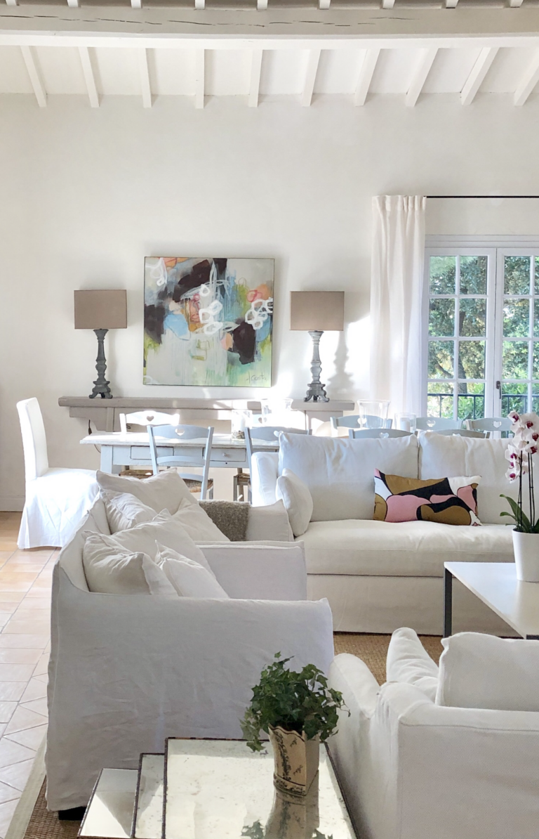
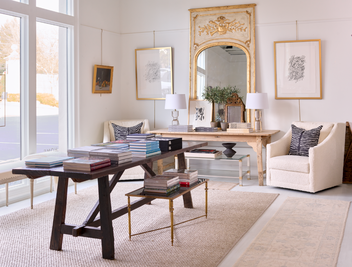
When we ran this photo of our recent renovation of Les Murets on Instagram last week, we received a very nice response — followed by requests to see the “before” pictures of the living room. We get it! We’ve always loved “before and afters” and wish that the shelter magazines would do them more. (Remember that magazine “Renovation Home” that featured them in every issue? I miss that!) It was easy enough to dig up some “before” pictures of Les Murets, which led me to scouring our other design portfolios to see if there were enough “before’s” to  make a story.  Happily, there were … and so here is our own version of Renovation Home, at least for today.  Enjoy!

The long ago before at Les Murets, twenty years ago.

The more recent “before” – ten years ago.

And its recent incarnation, today

We’ve been fortunate to have our share of “Show Houses” – which can be the perfect fodder for Before and After’s.

This was for the Cashiers Show House a few years ago. We had such fun redoing the guest house from scratch:

Here’s where we took it (photo by Erica Dines). A little paint, some new floors, great art – and photography!

Another year we were given a magnificent upstairs master suite, at another Cashiers Show House:

We decided to add a little touch of Parisian glam to this North Carolina mountain retreat!

When Meg first bought this beautiful house (“The Nest”), the outside was already so charming, I wondered where she could take it.

With her inimitable taste and a great team of builders, she took it right where it should be. Atlanta Homes & Lifestyles, who published the photos, said they still get asked weekly about the paint colors !

Pssst: Want to know the paint colors? Meg is sharing the secret: All from Sherwin Williams, the outside is Alabaster, the shutters are Pavestone and the front door is Wyeth Blue.

The living room of the Nest before it blew into …

This! One of our favorite rooms of all time. Erica Dines photo.

The dining room was already quaint …

But a crystal chandelier, a gorgeous French armoire and some fabulous art took it a big step further. Erica Dines photo.

The kitchen before …

Became the pantry! Erica Dines photo.

And the kitchen was expanded to this, with the perfect shiplap siding carried throughout.

Across the pond, we had another great project – and the smallest space we’ve ever tackled. How fun was this!

The little jewel of an apartment in Paris, before the renovation.

We loved transforming this into a soothing and pretty pied-a-terre.

The old kitchen was moved to the front …

And so we were able to add a bedroom!

Another little secret: We’ve now moved four kitchens in Paris. Here was the first:

The original kitchen in the very back of the apartment, facing a courtyard.

We turned that dark kitchen into a light and bright bathroom. …

Got rid of the study in the front ….

And moved the kitchen to the front, so that it would be light and bright, with a view.

We kept the original French doors and floors ….

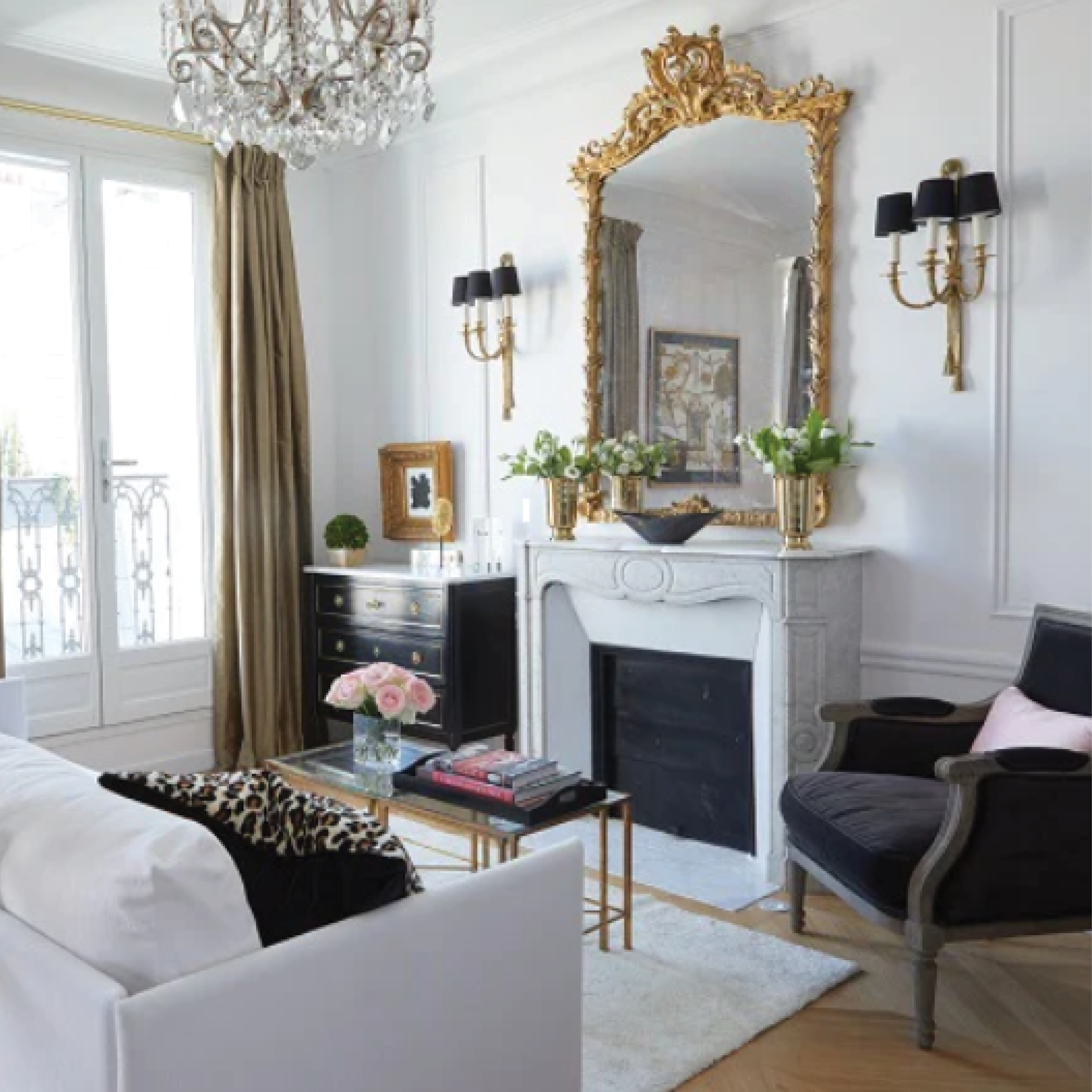
But just blew the living room open with chandeliers and mirrors.

In the same neighborhood, we were excited to get another assignment: This time a one-bedroom with a kitchen in the back (sound familiar?).

The perfect spot for a kitchen, don’t you think?

We did! And what a difference it made.

The living room before already had nice bones …

We just added the molding, lightened the floors and bought the biggest mirror we could find!

Across the channel to London, there was another “flat” to handle, but this time we kept the kitchen where it was !

The pretty kitchen from <a href="https://www.londonperfect.com/reservations/theme/londonperfect/accodetail?1&resourceid=1248007&tab=description&selection=y7a75Tt77HDJk84YHzIjFol1brI5QIU5w8Bvgx87ykY%3D" target="_blank">London Perfect’s Victoria</a> townhome in Kensington

We actually were so busy that we never took before pictures of this renovation …

But done in three days with no time to spare, we all had to wear many hats!

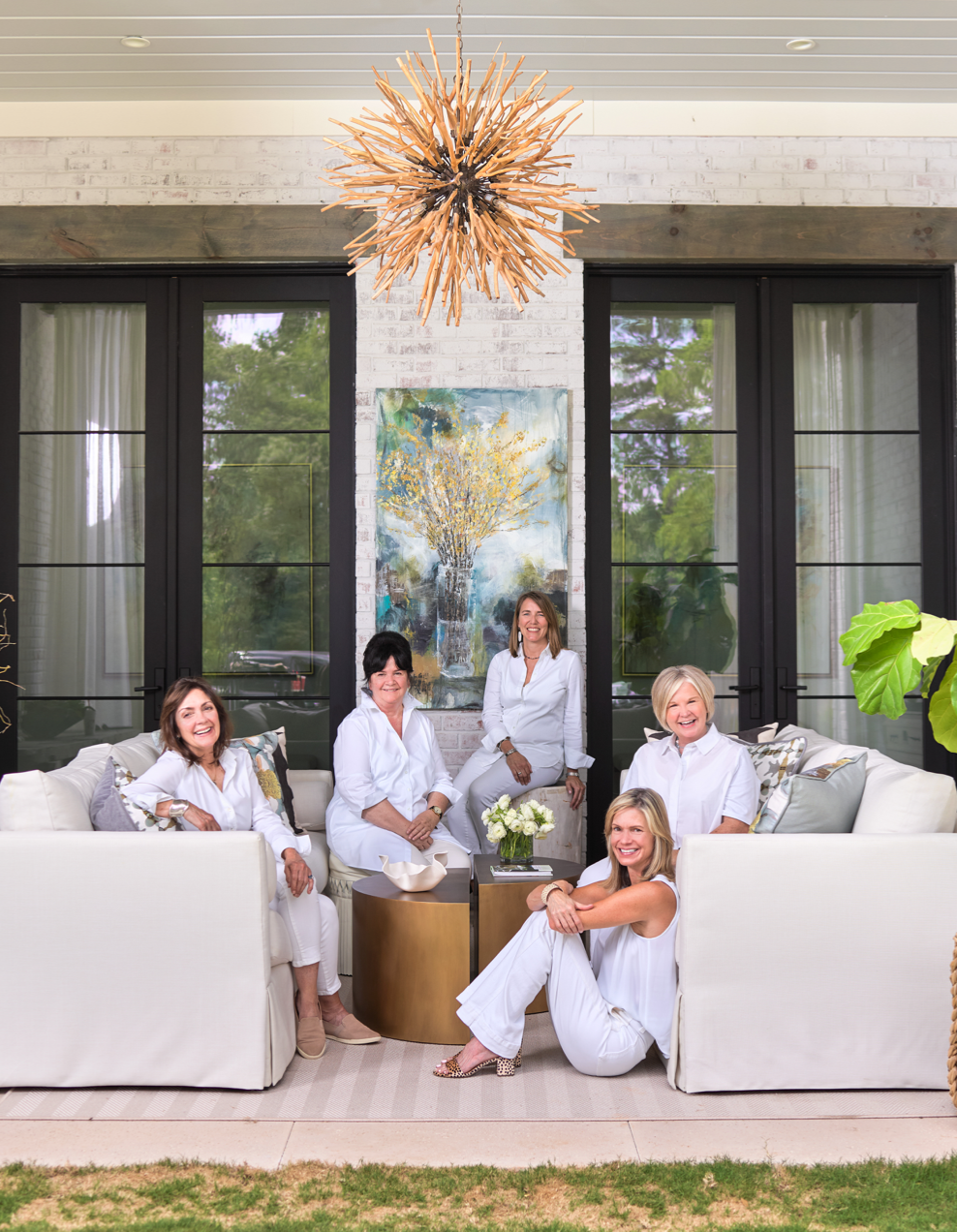
And speaking of wearing lots of hats, have you met our design team responsible for the “After’s”?

Sam Jones, minus the lampshade in London!

This team of capable Huff Harrington designers will happily turn your before’s into after’s ! And speaking of which, we’ve got another before to tackle:

Our newest “Before” is waiting for its “After”

We’ll just try not to get distracted by the view!

Ta ta,

HH


P.S. We thank our clients for these and other wonderful opportunities. As always, all our Before’s (and After’s) remain confidential unless we ask and receive your permission to publish.

Leave a comment

All comments are moderated before being published.

This site is protected by hCaptcha and the hCaptcha Privacy Policy and Terms of Service apply.