
When we first saw the 4th floor Sancerre apartment, on one of our favorite streets in Paris, we were faced with a project that had already been renovated. The previous owners had stripped it of its Haussmanian glory and turned it into a modern shell. Gone were the moldings, the mantle, the beautiful windows, the original herringbone floor. Instead, it was a long and narrow apartment with one bathroom, two bedrooms and a separate kitchen.

Meg and I had the same reaction to the space when we saw it: Brrrr! It’s not that there was anything dramatically wrong with it, just that it needed to be warmed up and rearranged completely. Our clients could have almost kept it as is, but when we offered up a new plan to turn it into into a gracious 2 bedroom, 2 bath apartment with plenty of open living space and a fabulous view of the Eiffel Tower, they wholeheartedly agreed.

Before

After
The first thing we did was to take it back down to the studs and reconfigure the layout so that the piece de resistance, the sparkling tower, could be admired from every room. Playing with tricky angles and quirky plumbing, we replaced the existing kitchen with a bedroom that favored a gorgeous view of the Eiffel tower, and were able to sneak in a small but sexy ensuite bathroom. We put the main bedroom on the opposite side of the apartment with a more spacious ensuite bathroom and loads of closet space. That opened up the whole middle of the apartment where we installed the kitchen, dining room and living room, taking advantage of 6 full windows bordering the avenue. Then we proceded to add all the elements that had been stripped out of the apartment in the previous update: the moldings, the herringbone floor, the old fashioned (but triple paned) windows, and even an antique mantel.

The original inspiration: Hermes scarf

All the colors flowed from there
Our vision for the interior was inspired by this gorgeous Hermes scarf, which set the tone for the colors of the kitchen and furnishings. With help from our Atlanta office and lots of back and forth design ideas (not to mention some heavy schlepping of wallpaper and pillows from Huff Harrington Atlanta!), we used a mix of antiques and modern furniture and art to warm up the interiors.

Dining Room

Kitchen was moved from the back
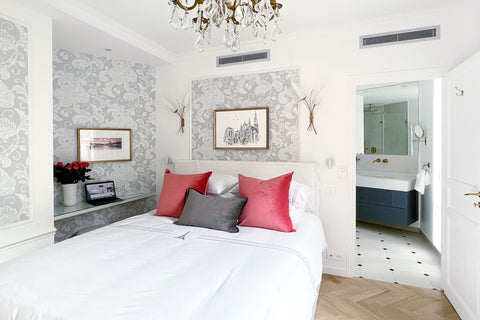
Main bedroom with its ensuite bathroom

Main bathroom

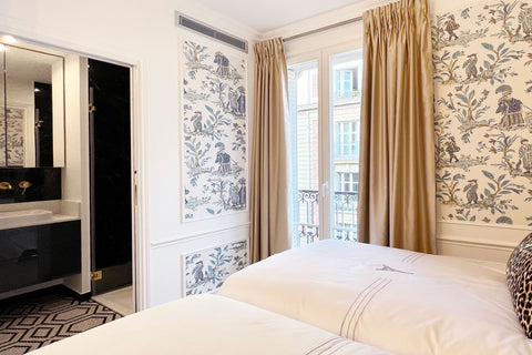
2nd bedroom

... with its killer view of the Eiffel Tower!
And sexy en-suite bathroom

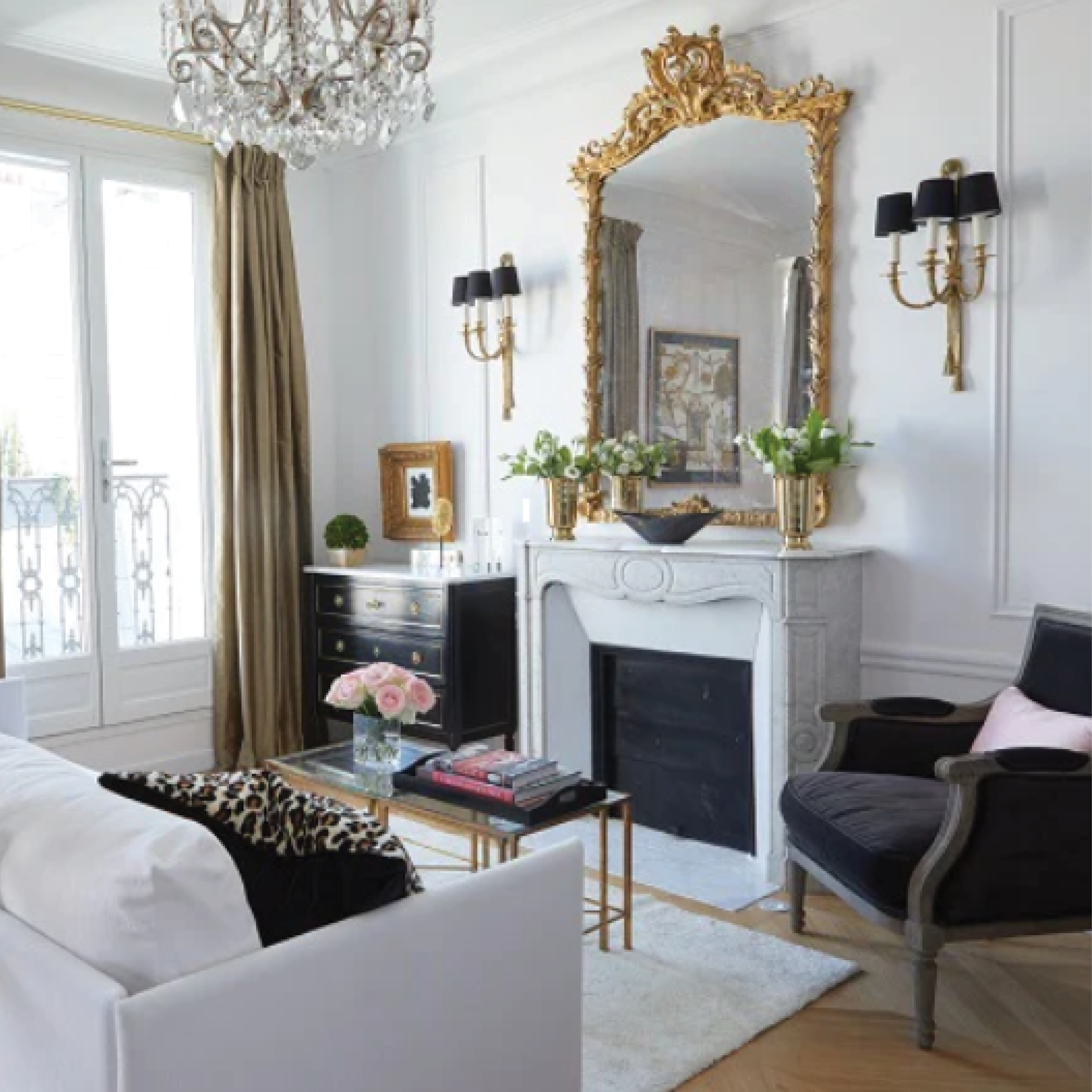
Some of my favorite items are the gorgeous chandeliers, the elegant wallpaper, and the warm and functional drapes. I think the best description is that it’s gone from gloomy to glowing, basking in the warmth of the furnishings, wall coverings, drapes and mostly, afternoon sun. Not to mention the glow of the Eiffel tower as it sparkles in the evening.

The living room sparkles with light from the wall of mirrors, the chandelier and of course, the Eiffel tower!

Details, even in the bathroom

So even though the before and afters may not be quite as dramatic as some apartments we’ve done, this one has my heart because of its complete reconfiguration. Our goal was to make it look and feel like it had always been this way, reflecting Baron Haussman’s 19th C vision of Paris. Although we’re sharing our little secret with you, I’d like to think that if you didn’t know, you would assume that this is the original layout and all the trimmings. As if it was barely changed from the 19th Century, save a few small details like wifi, microwaves and an induction stovetop!
If this is your dream of what life should be, you could actually have a piece of it! Just contact our friends at Paris Perfect and they’ll fill you in on the details.
Ta ta,
HH
PS All the "after" photos here are courtesy of the wonderfully talented @georgiannalane.
PPS Do you want to see more? Paris Perfect has written a nice blog about the apartment, right here.


1 comment
Diane
Fabulous!!!!
Fabulous!!!!