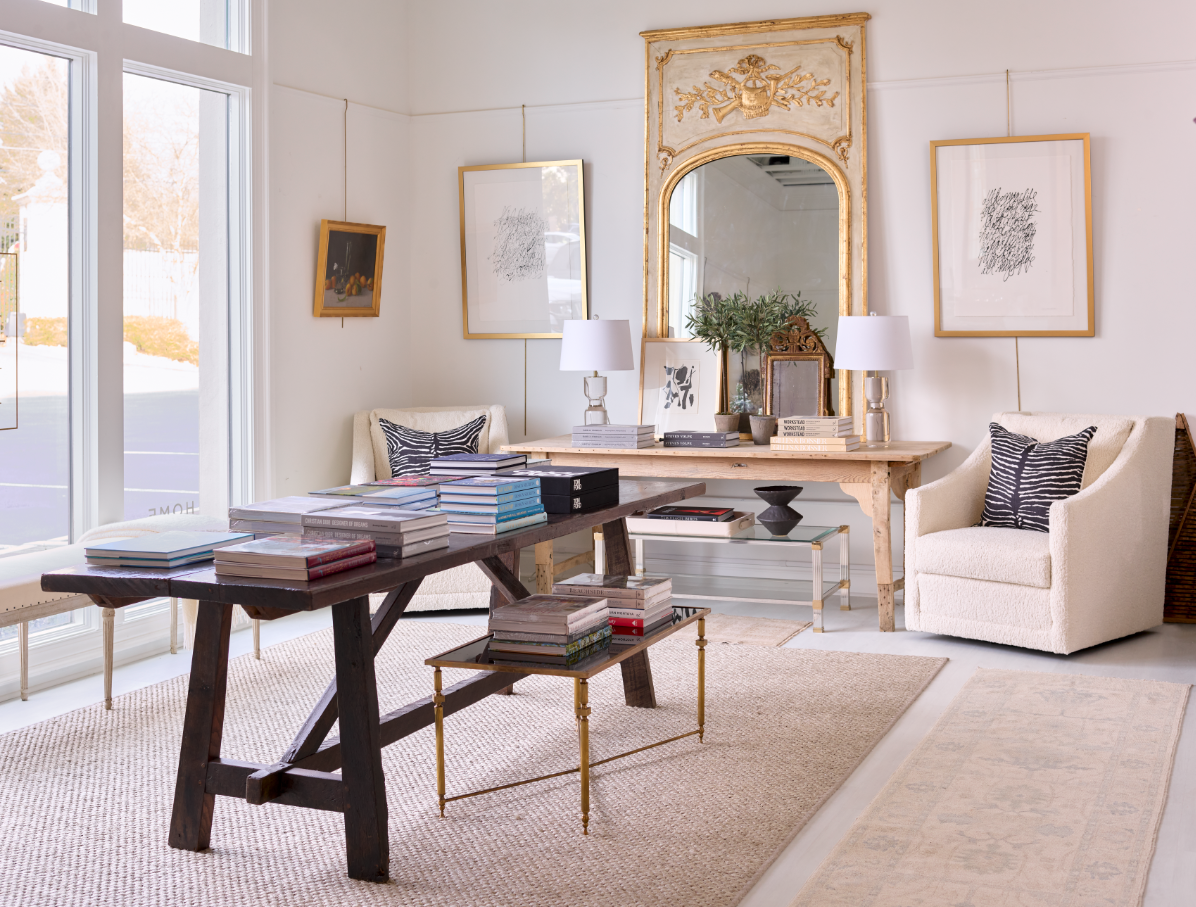
This may not be what cupid had in mind with Valentine’s Day, but to those of us in the art, furnishings and interior design fields, love is always in the details!
When we were in Paris renovating the Cairanne apartment, we struggled to find that level of layering that we call “dec acc” (decorative accessory) that completes a look, just like jewelry or accessories complete an outfit. In fact we caught the church giggles at a book store, when we were busted by an earnest salesperson who was appalled by the superficiality of our book selections, based on color and size rather than content: “That one’s too pink,” or “That one’s not thick enough ” or "It needs a black spine!" With these demands, we shocked the salesperson and gave new meaning to the adage of not judging books by their covers!

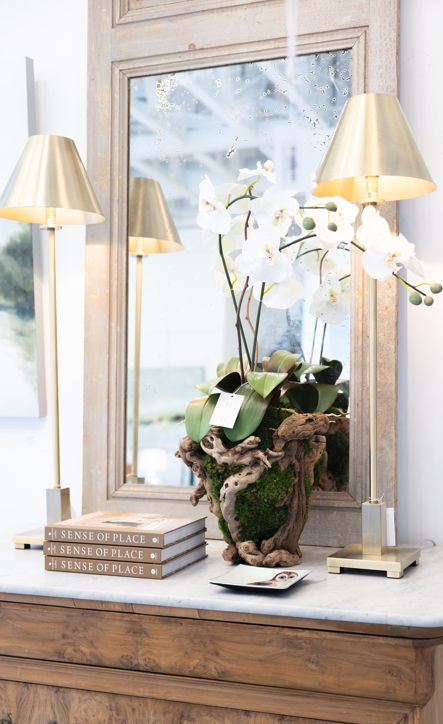
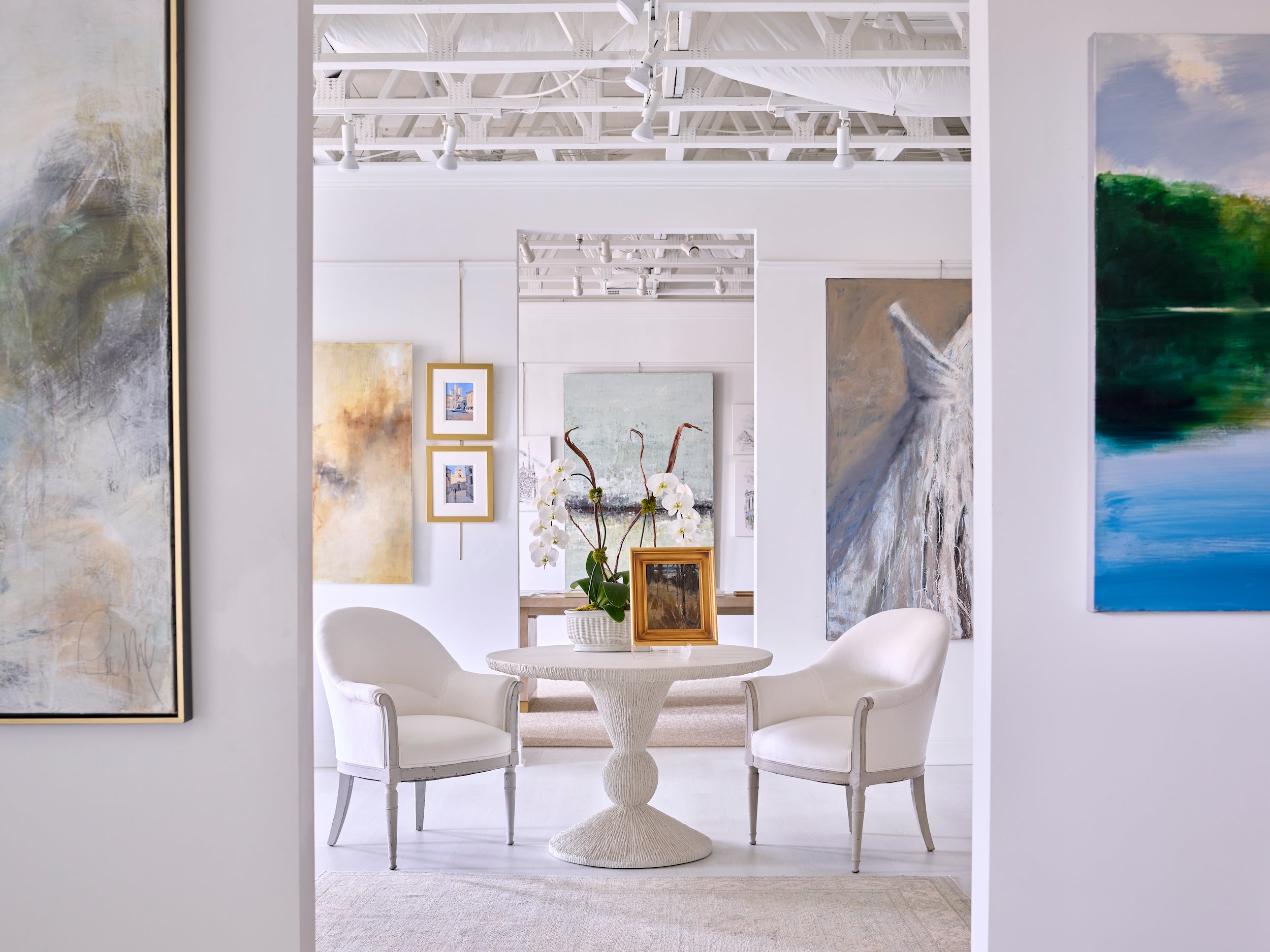
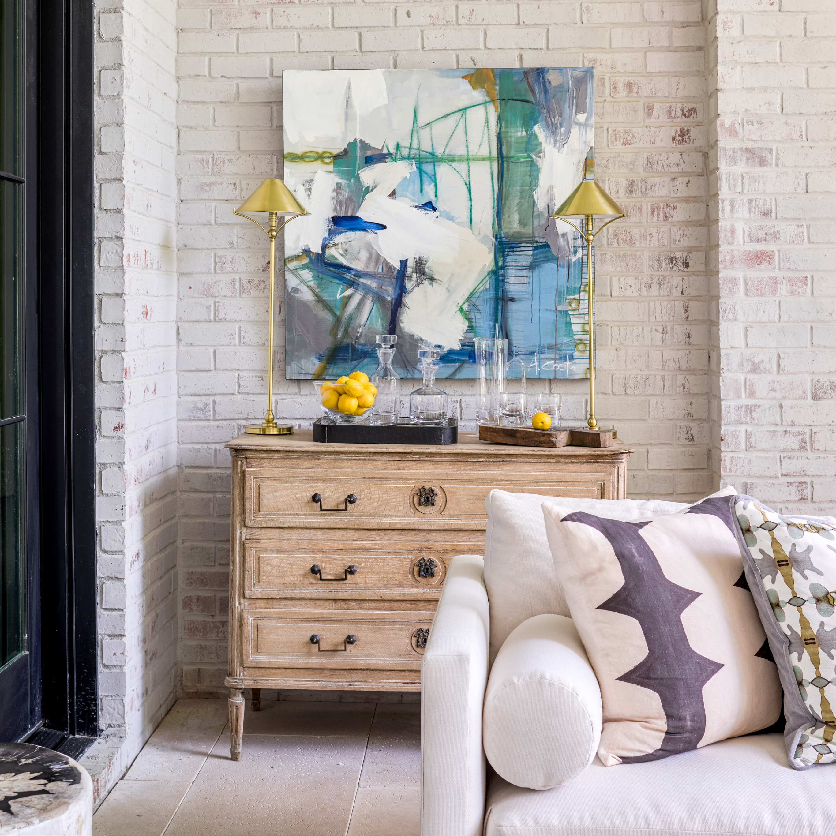
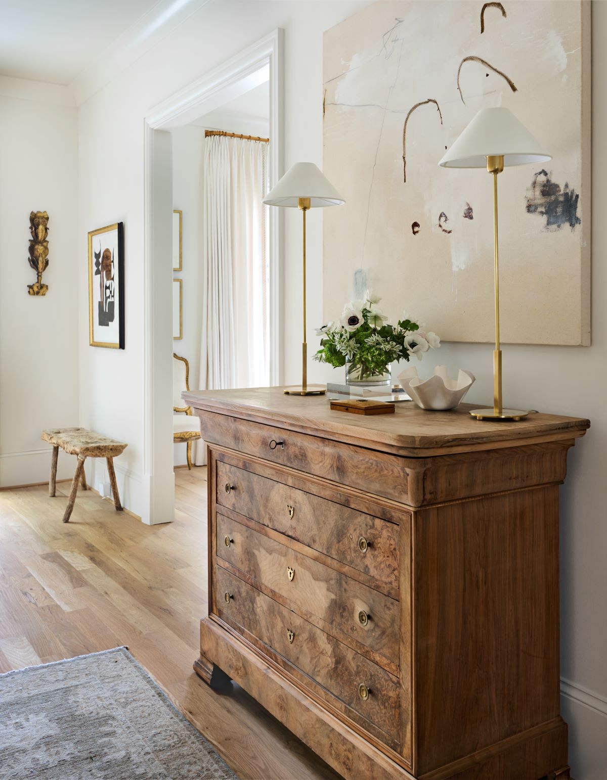
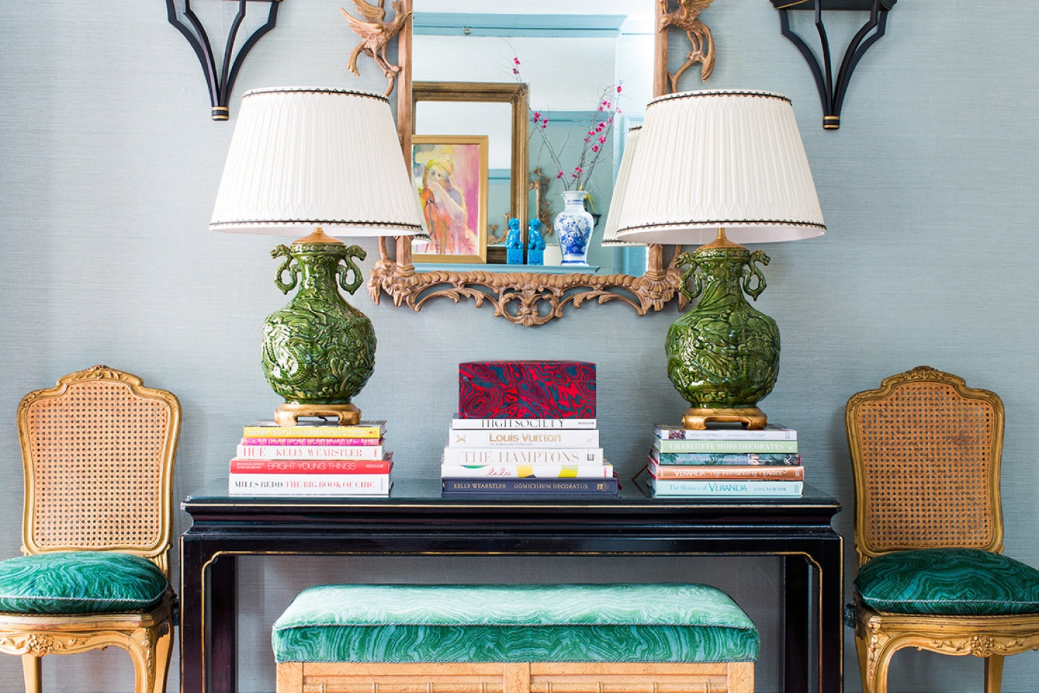
Whether it's the right coffee table book, the pretty pleat in a curtain or the perfect pairing of paintings, details can make or break a room. Of course finding the accessories is only part of the challenge: The real creativity comes in pulling it together and making the details look effortless. When we talk about loving the details, there's really no better way to create beautiful vignettes than by using a mix of objects collected over time, and arranged in an interesting and masterful way.
On one of our recent buying trips to Paris, we were fortunate to have three incredible designers in our group who showed us over and over, through their keen eye for details and the products that caught their attention in Paris, that they were masters of assembling the kinds of vignettes that make a room.

Paloma Contreras of Houston, Anne Wagoner of Charlotte and Mallory Mathison of Atlanta are all design pros who know just how to pull together the details that make up a vignette come alive. They impressed us in Paris with their electic and refined purchases and it's so fun to see how these pros deftly use details to make the room sing. Treat yourself to a visual tour of the clever detailing in each of these vignettes:


We've already talked about how fun it was shopping with Anne Wagoner, who had a keen eye for even the smallest painting tucked in the back of a vendor's stall, knowing it could find a place of honor in any one of her clients' homes. Here's a visual sampling of how Anne Wagoner uses layers of details to create a warm and personal environment for her clients (with images from her website):


If you don't follow Paloma's incredible blog (A Dolce Vita), stop what you're doing right now and sign up for it! Paloma is a magnificent designer who also has a great eye for detail, as we were able to witness through the purchases she made in France. These vignettes (from Paloma's website) are typical of this designer's carefully edited, classic style that is always mixed with a little je ne sais quoi surprise element.


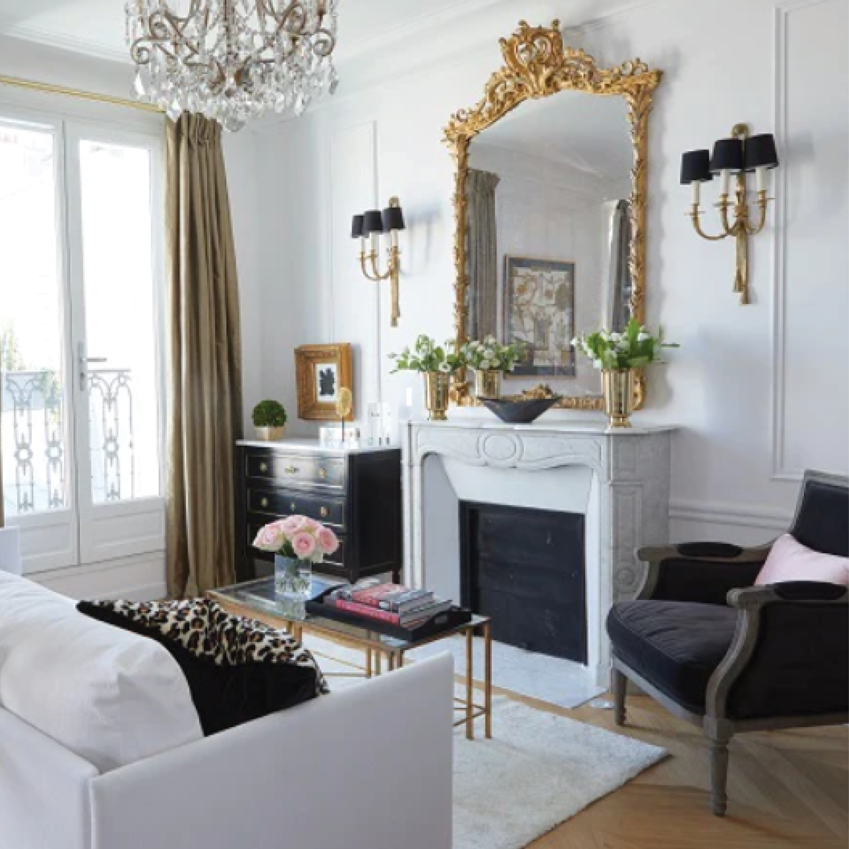
Details are a blast. On our last night in Paris, with minutes to spare on finishing the renovation, we had our own Aha moment when we lit the beautiful chandelier, juxtaposed the antique art with modern art reflected in the mirror, and paired it all with vintage flea market pottery and a gold accessory found in a street market. The photo may not do it justice, but for us in the moment, it was pure love!

So for all of us who are passionate about design, and in the spirit of Valentine's day and all the things we love, here's a toast to many more Aha moments from the love of details. Cheers!
Ta ta,
HH
P.S. If you share our love of details, and are looking for a fun experience to uncover treasures in Paris, join us for our buying trip september 25th to October 1st. Our trip in March is full but we still have openings for the fall and we'd love to have you come along!

