This week, a very nice gentleman came in to the gallery on a mission. He said he needed a painting to go over his mantel but that he and his wife couldn’t agree on what it should be (stay tuned for another blog on that topic!). He had measured the space carefully and asked to see everything we had in a 30 x 40 horizontal. He had clearly been looking for a long time and was tired of having a big, blank space over his mantel.
We asked him a couple of questions about what he liked and didn’t like, and then suggested he take a quick spin around the gallery to see if anything reached out and grabbed him. He did see quite a few things he liked, but they didn’t fit the size requirement, and so he was a little frustrated. We’ve been down this path so many times with so many different clients that we decided to address the issue head on.
Does the space over the mantel really have to dictate the size of the painting?
We don’t think so. In fact sometimes it’s much more interesting if it doesn’t. We don’t believe any space should dictate the size of the painting. Only your heart.
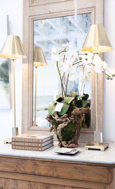
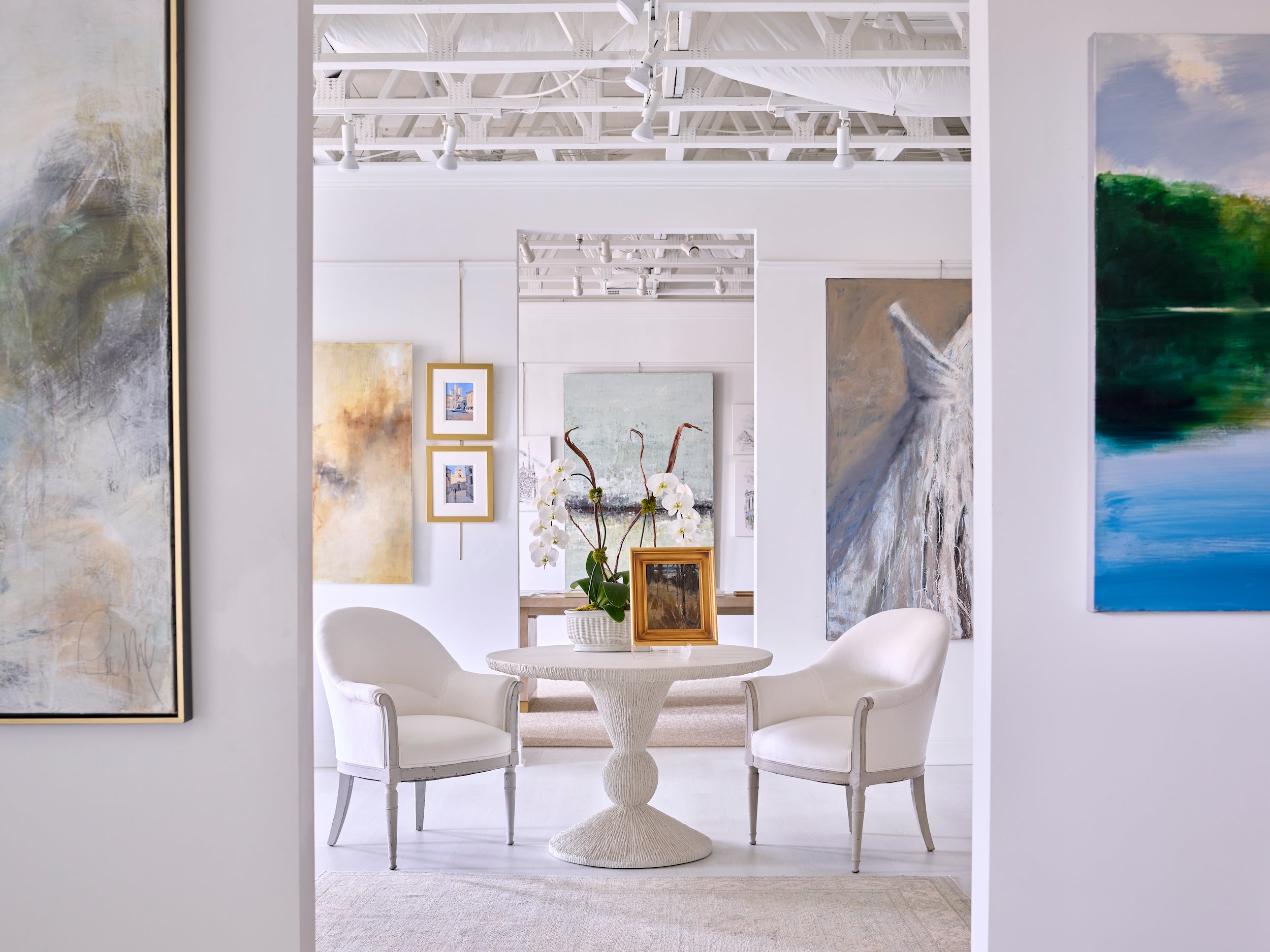
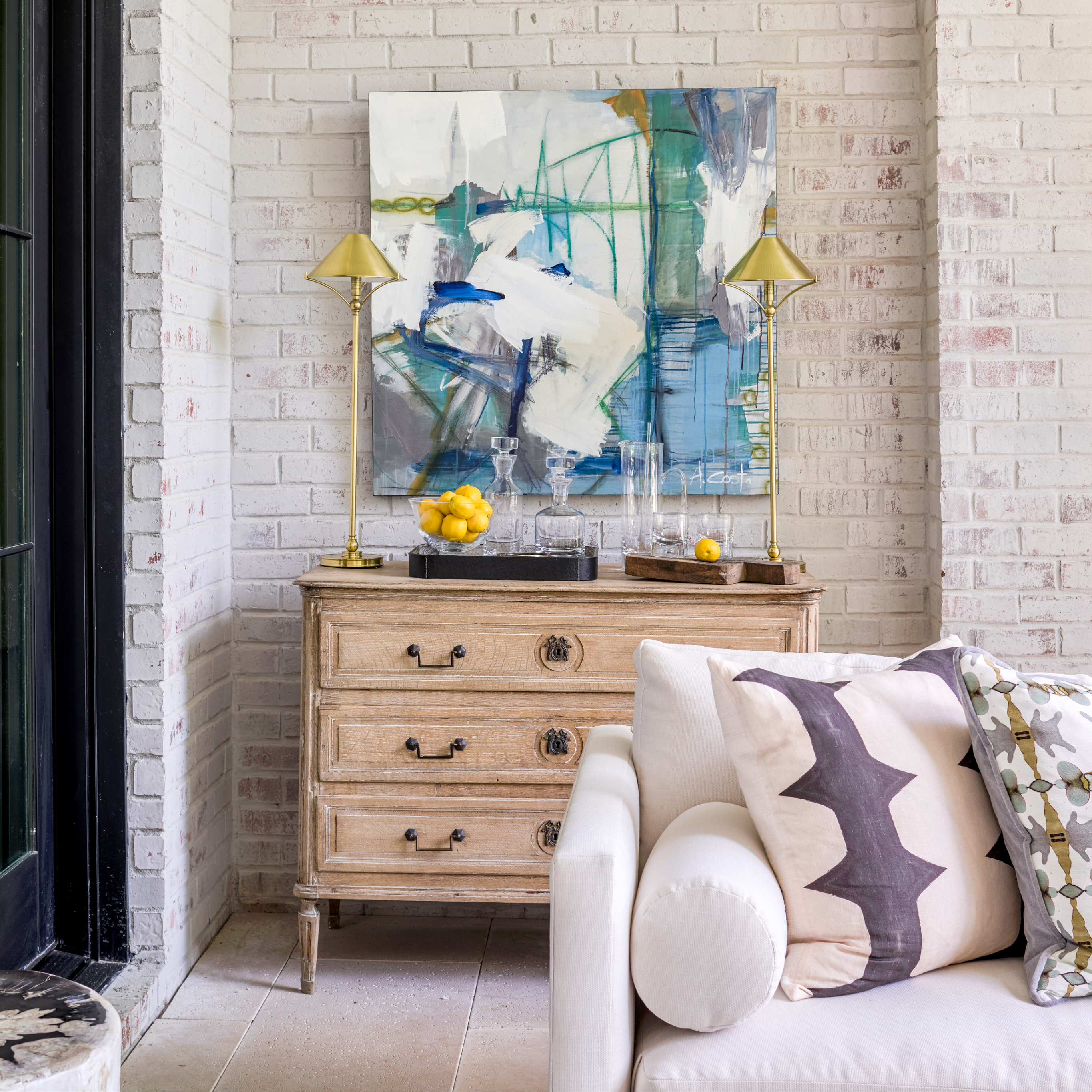
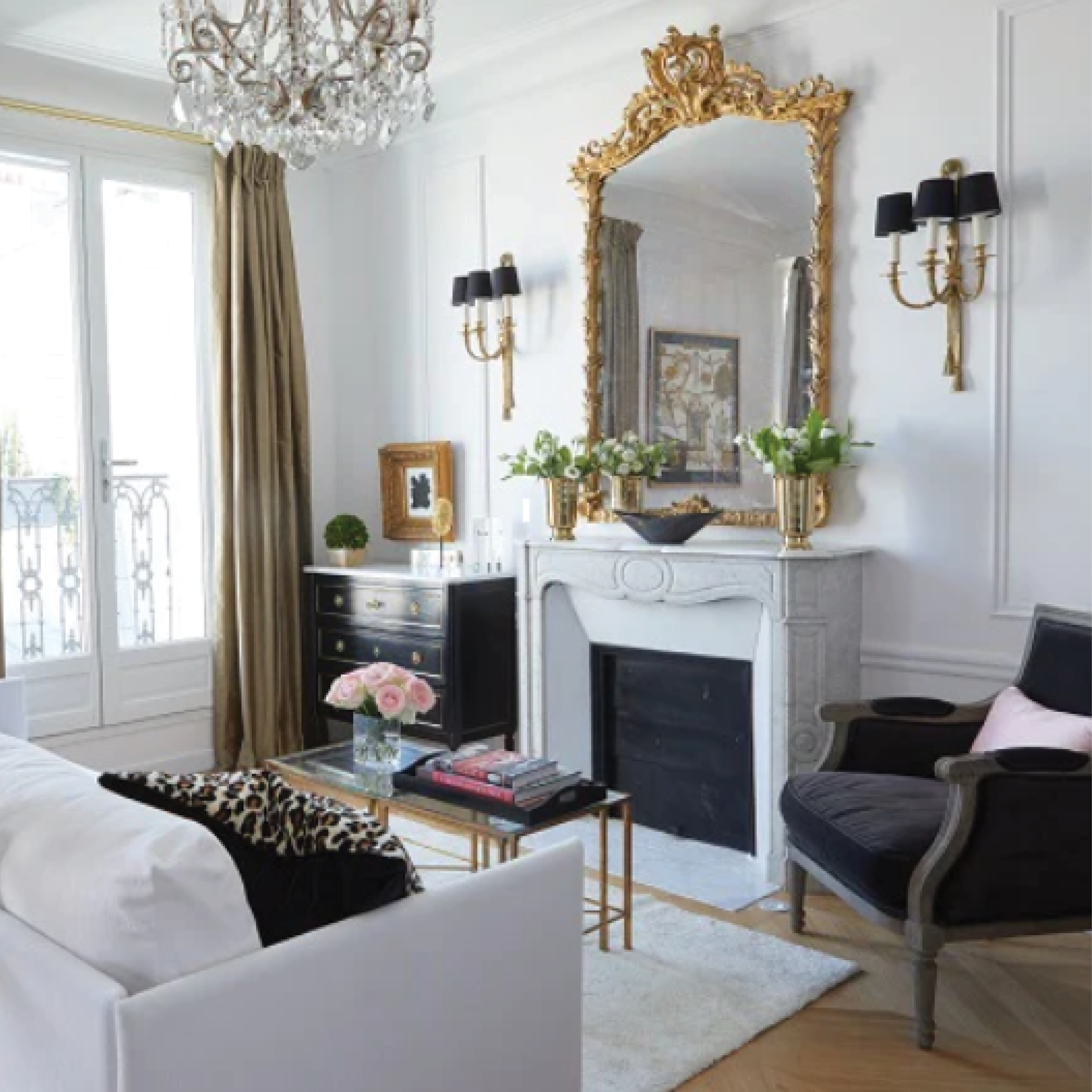
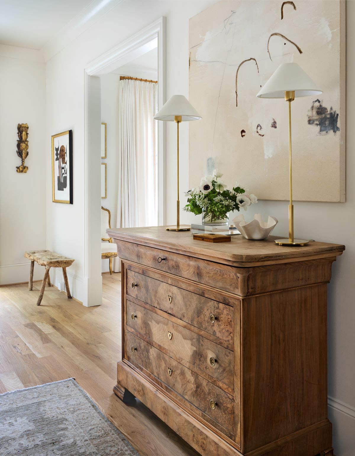
There are lots of creative ways to handle the mantel, even if you don’t have to have the “perfect” painting – or even if you do. We’ve pulled together some fun examples from designers around the country, many of whom were recently featured in House Beautiful. You’ll see examples of making the painting look bigger, by adding sconces or three dimensional elements, or making it look smaller, by dwarfing it with other objects. Sometimes you’ll see groupings of several paintings instead of just one, or paintings layered behind each other, to give a sculptural effect. And you’ll see lots of examples with other solutions for the mantel, such as sculpture, mirrors, driftwood, and other objects. And sometimes you’ll see that a blank wall is actually the most powerful. The key is to take the pressure of the mantel in terms of “trophy” art work, and always buy the art that speaks to your heart.

If you have a small painting, add other elements to fill in the space. If you do this, keep form and scale in mind, as Mona Hajj has done here. The pitcher on the right here balances nicely with the vase on the left and they’re both big enough to sustain the length of the mantel. And their forms are attractive.

